

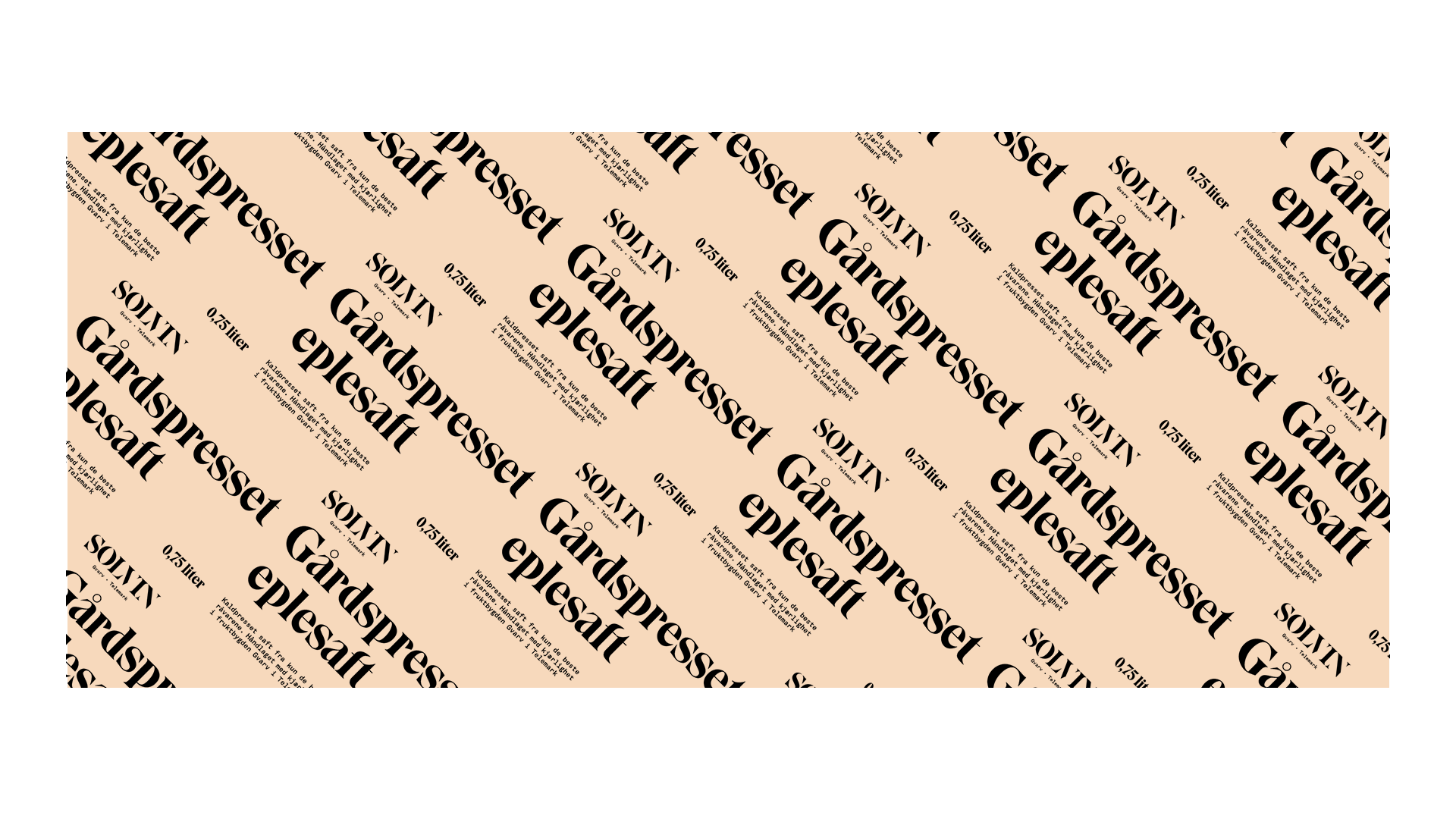

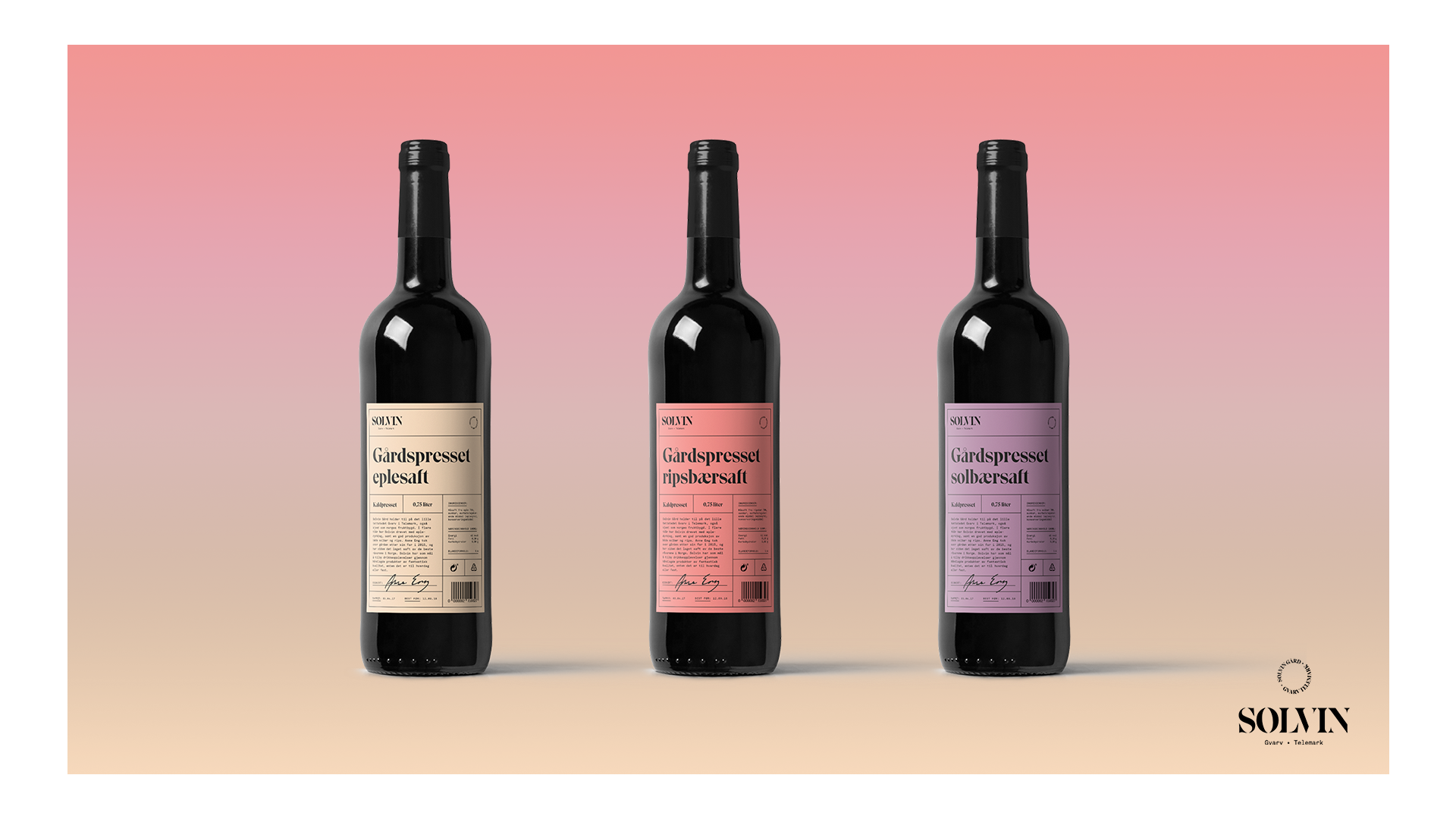


Branding and packaging created for the fictitious farm Solvin in Telemark, Norway during our fourth term at Westerdals in spring 2017. Solvin is a farm that grows different fruits, vegetables and berries, and our task was to create a visual identity for the farm and design the packaging for their squash ('saft' in Norwegian) and a series of by-products.
Since the squash market in Norway is quite one-dimensional with a lot of cheap products with the same kind of colorful design, we chose to go the opposite way and differentiate ourselves as a more high-end and handcrafted product. By evoking the feel of wine instead of the cheap plastic bottles one usually relates to squash we hoped that we could reach a target group that enjoy the quality of handcrafted products that comes straight from the farm itself, instead of the mass-produced alternatives found in grocery stores.
As previously stated, we were also tasked with creating a series of by-products that would enhance both the brand and the mainline, so since our target group was people that enjoy quality food and drinks, beer seemed like a reasonable by-product. Considering Solvin was a farm with a solid production of different fruits and berries, we just went ahead with beers brewed on those to differentiate ourselves from other breweries.